Mastering Responsive Web Design: Best Practices and Inspiring Examples
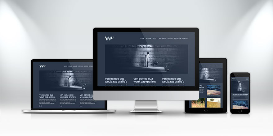
In the ever-evolving digital landscape, responsive web design stands as a fundamental approach to creating websites that seamlessly adapt to various screen sizes and devices. This article delves into the core principles and techniques of responsive web design and explores some stellar examples that illustrate its transformative potential.
Key Features of Responsive Web Design
Responsive web design is a versatile framework comprising essential features:
- Media Queries: These CSS rules enable designers and developers to apply different styles based on specific conditions, such as screen width, height, resolution, or orientation. Media queries facilitate the creation of breakpoints, pixel values that dictate layout adjustments according to screen size.
- Fluid Grids: Instead of fixed pixel values, fluid grids employ relative units like percentages, ems, or rems for element sizing and positioning. Fluid grids empower elements to adapt, resizing and repositioning themselves according to available viewport space, resulting in flexible and scalable layouts.
- Flexible Images: Images that dynamically adjust size and resolution to match screen dimensions and device requirements. Achieving flexible images can be done through CSS properties like max-width, object-fit, or srcset, or through JavaScript solutions such as picturefill or lazysizes. Flexible images ensure images fit within containers and remain crisp on high-resolution displays.
Crafting Responsive Font Sizes in Bootstrap: Best Practices and Techniques
Inspiring Examples of Responsive Web Design
- Dropbox: As a cloud storage and file-sharing service, Dropbox’s responsive website employs fluid grids and flexible visuals to create a remarkable user experience. It adapts seamlessly across devices by altering the number of columns, image and text size and position, and the visibility and functionality of navigation elements. Media queries are also used to apply unique styles and animations for various breakpoints.
- Dribbble: Dribbble, a platform for designers to showcase their work, leverages a combination of media queries and flexbox to craft a responsive grid layout. Depending on screen size, it dynamically adjusts the number of columns and rows. Media queries fine-tune typography, ensuring optimal readability.
- Airbnb: Airbnb’s global accommodations platform boasts a responsive design that employs media queries and grid systems. The layout adjusts based on screen size, displaying varying numbers of cards and columns. Media queries also control the size, position, and styling of various elements, offering users a seamless browsing experience.
- Slack: As a popular communication and collaboration platform, Slack’s website optimizes its layout through a combination of media queries and flexbox. Depending on screen size, different sections and elements are displayed. Typography is finely tuned using media queries to ensure consistency and readability.
- Spotify: The music streaming giant, Spotify, utilizes a combination of media queries and grid systems to craft a responsive layout. This layout adapts by displaying varying numbers of cards and columns, depending on screen size. Media queries also control the size, position, and styling of images, text, buttons, icons, and menus.
Conclusion: Elevating User Experience with Responsive Design
Responsive web design remains a cornerstone skill for web developers in today’s era of diverse devices. With media queries, fluid grids, flexible images, and other techniques, developers can create websites that effortlessly adjust to various screen sizes and devices without compromising functionality or aesthetics.
The showcased examples underscore how responsive web design can yield stunning websites that provide a stellar user experience, regardless of the device in use. By mastering these techniques, web designers and developers can ensure their creations shine across the digital landscape.